Starbucks Partner Hub Redesign
Role: Oversee design direction/information architecture/interaction design, UI design
Objective:
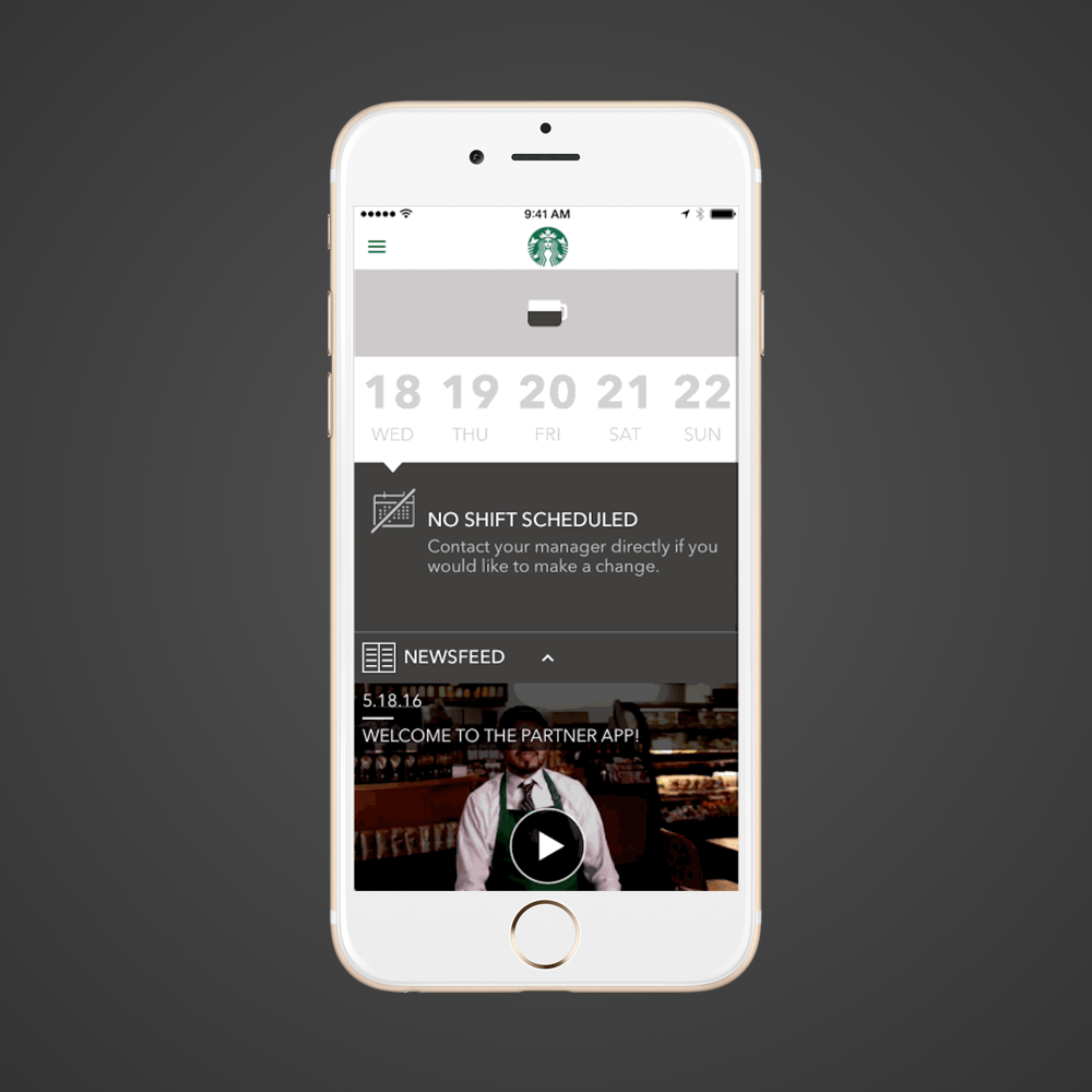
The Starbucks partner hub (partner.starbucks.com) is used daily by partners (employees) in the HQ building, but most importantly, retail partners (in-store) across the country and Canada. It has plethora of information pertaining to partner info, pay, benefits, company news, and store resources and alerts.
It was launched 7 years ago via Sharepoint, and was in a dire need of a design uplift. Some work to make it responsive was done a while ago, but many functionalities were broken. Aside from the cosmetic needs, the information architecture of the whole site was left up to many individual contributors, which made it very difficult to navigate through. The end goal of the project wasn't only to make the site pretty, but to reconstruct the navigational features to surface topics that are the most important to our retail partners and make it as easily accessible as possible.
Process:
The Starbucks brand team prior to this has provided the partner team with a high level design guide for the new partner digital look and feel. The initial ideation phase was done by a local agency - I oversaw the process with the partner digital product team to see that the design was headed to the right direction, the visual elements were in line with what the brand team had initially envisioned, and if the interactions of the new feature functionalities made sense. Also, once the ideation deliverables were handed off, I worked closely with the engineering team and a team of analysts to fill in the gaps.
The biggest problem with the old design was that retail partners - especially store managers and shift managers - who are consistently using the site on a daily basis and were having trouble getting to the most important information. For example, they were taking several clicks to get to the info they need, or didn't know that certain buttons were buttons, and were constantly calling the help desk or neighboring stores to find out where the information they needed was.
I collected the most frequent feedback from the partner support teams, and interviewed 10 different store managers & shift managers on how they go about using the partner site.
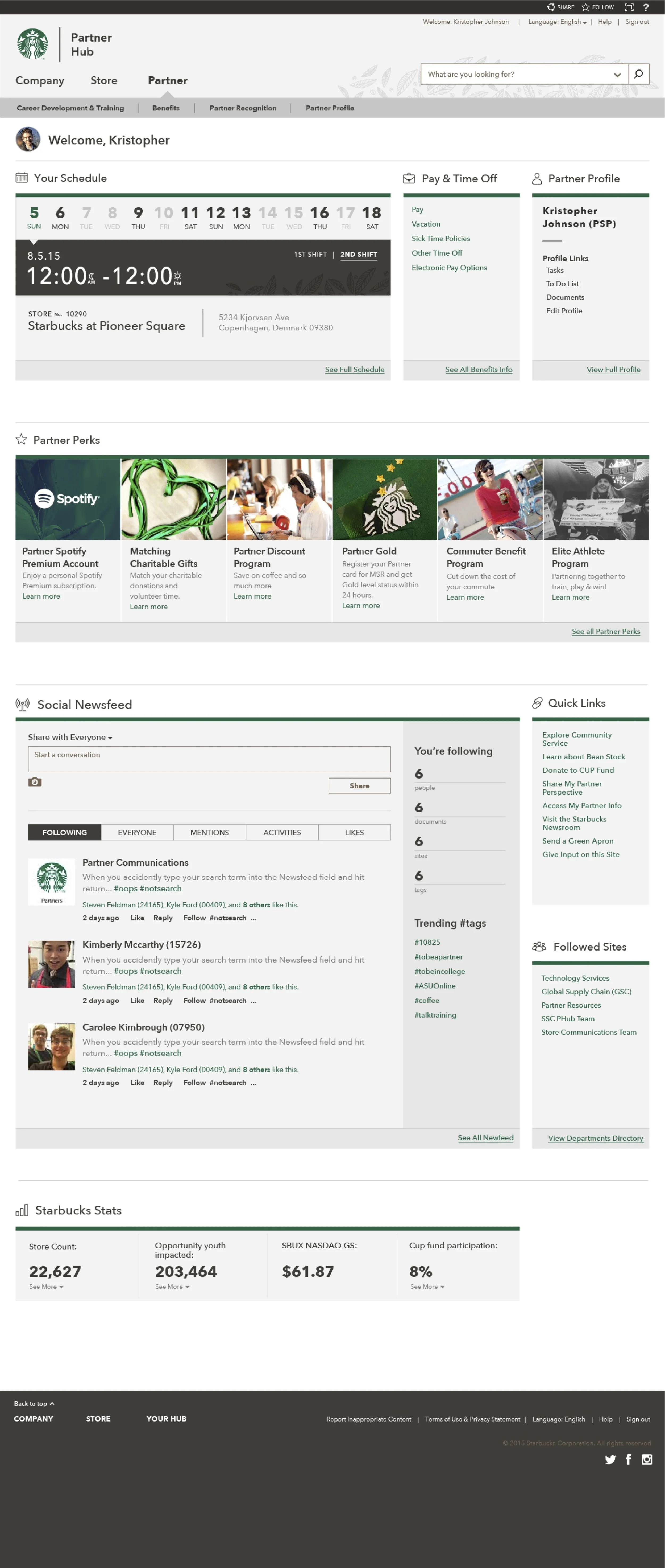
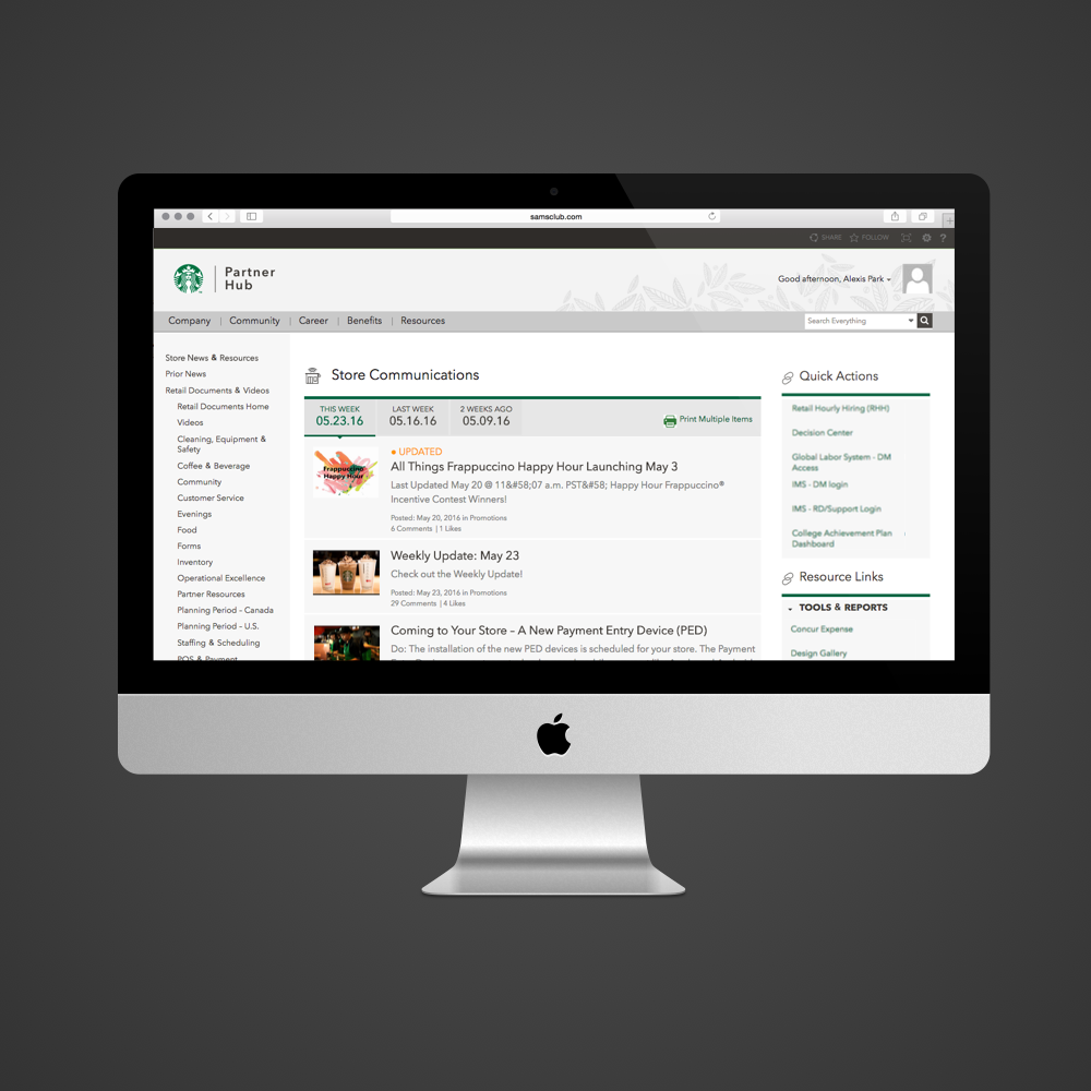
Prior to redesign:
You can click on each screen to see them in detail.
Iterations:
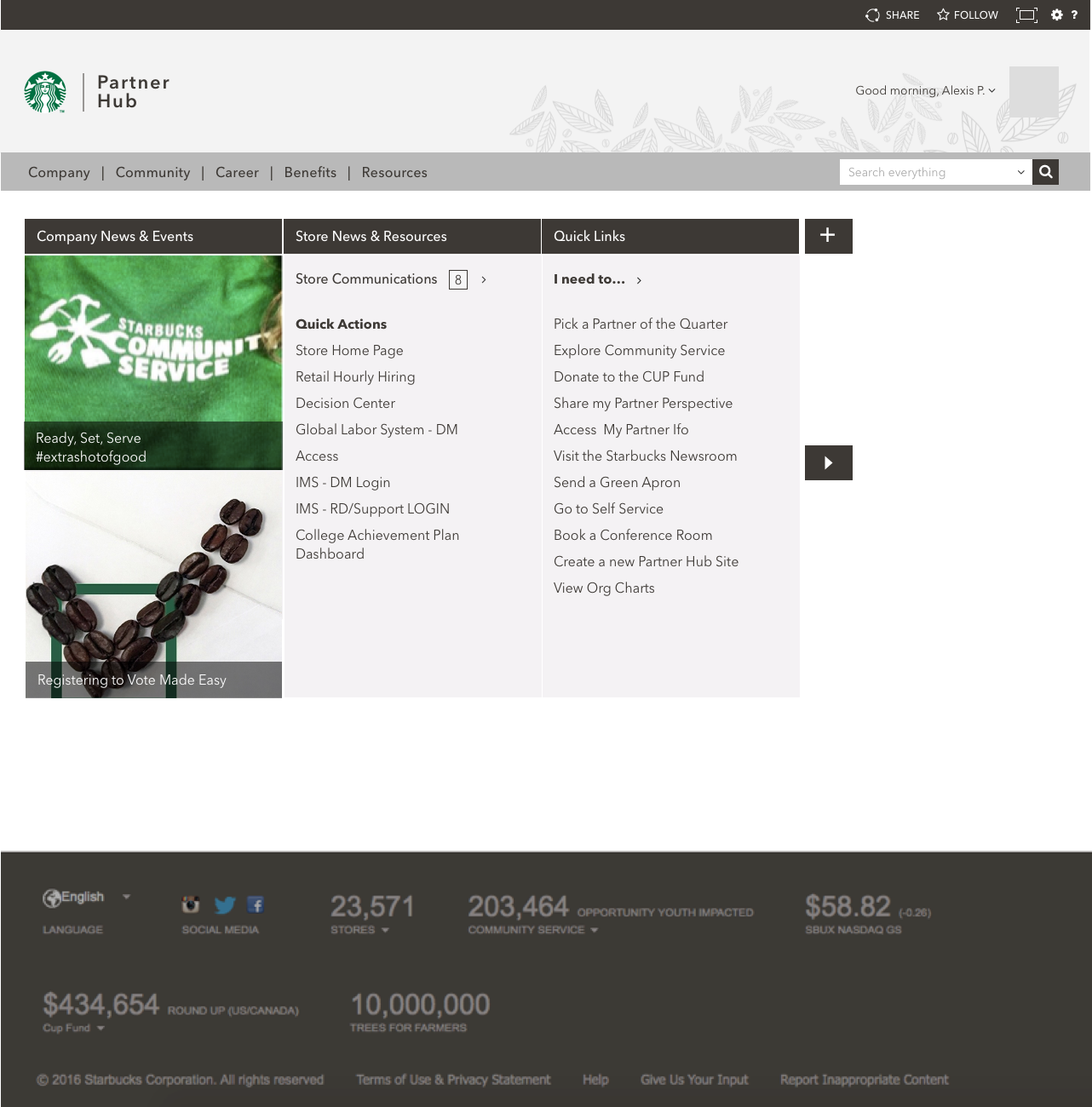
You can click on each screen to see them in detail.
Beginning phase
Later phase
One thing that changed significantly throughout the phases is the information architecture of partner hub. I conducted unmoderated open card sorts, and moderated closed card sorts with about 30 partners across the country using Userzoom, and also conducted in-person testing to see how they would go about logically rearranging the hierarchy of some pages, and how they would go about re-naming some of the categories ("What's 'business acumen'?).
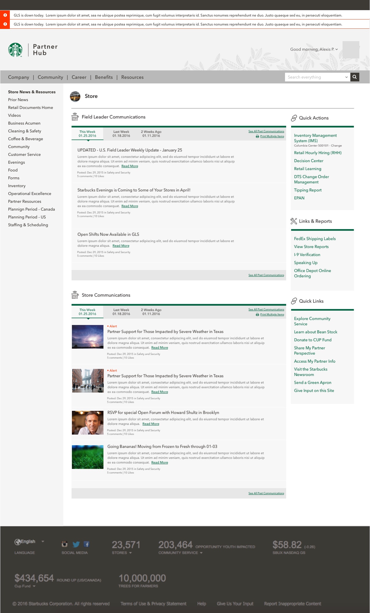
Latest:
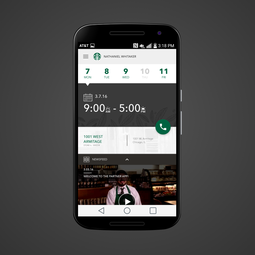
In the end, because sbux will be moving platform the site is built on at the end of the fiscal year, we had to park a lot of the new designs as future stories. Some immmediate solves we were able to implement were tackling a few of the biggest issues.
• For in-store partners, we surfaced store news and resources first, and surfaced the most-looked up links to the top/above the fold, which decreased the number of calls by 26% upon launch.
• Alert functionality for quickly communicating system downs or natural disasters
• Entire site got a new look and feel.
Takeaways:
There are many difficulties I ran into while working on this redesign. In the beginning of the phase, I came up with a lot of ideas that quickly turned out to be very difficult to implement. I had to have many discussions with the development team to fully grasp how the functionalities were originally built. In the end, we discussed how we can improve the current functionalities as much as we can, while also providing a brand uplift. We're currently working on testing the final proposed designs. Constant communication with all cross-functional teams is (insert key emoji here)
Thank you


