Finn by Chase
Role: Design lead
Project overview:
Finn by Chase is an all-digital banking app aimed for the “Millennial” audience. This was an ambitious project that Chase had in mind for since 2014 that finally came to fruition in 2017. We had our startup hats on, and with rapid prototyping, testing and iteration, we launched this v1.0 fully mobile consumer bank product within a year.
Process:
We wanted to start out by truly getting to know our target audience better. With Moment, a design strategy firm, the team went out to 3 different cities, and interviewed 50+ people. We intercepted them at a bar, a cafe, and tried to get to know about their life's ambitions as much as possible.
The big questions we wanted answered are: what are our users' goals? What are their ambitions, and what do they need from innovation in banking?
Findings:
We ultimately found out that our participants feel out of control with their finances, and needed a different way to connect with their money.
With that direction, we began formulating what our core features should be and how we would help them connect with their finances. We had two rounds of workshops involving stakeholders from various cross-functional teams, and generated a concept of helping customers reflect on their spending by rating them.
Through a longitudinal DScout study with 60 participants, we validated that majority (66%) of participants found this method of looking at their finances helpful.
Trends and insights:
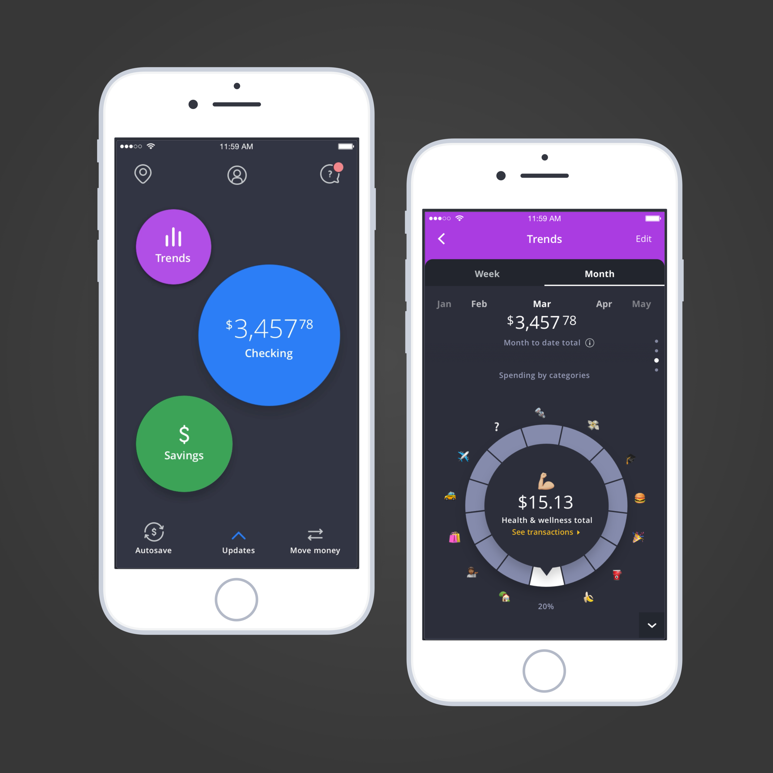
Along with transaction rating, we identified the ability to provide trends in their finances and insights as one of the core features for our MVP. I quickly created concepts that would best serve up the information to understand its initial reception to users.
Initial concepts:
The concept of rating transactions, when coupled with insights about their money, was received incredibly well by participants in research.
Iterations:
I dug deeper into the trends and insights portion to learn the different way to visually deliver the data we gather. The question to constantly come back to was, what is the simplest way we can portray this much data, while delivering the maximum value?
Trends screen wireframes:
This is a sample wireframe depicting some of interactions, nuances, flows within the earlier "Trends"page
Final look at trends:
Styleguides + Process work
After the nitty gritty production work has been delivered, I created a brand voice/styleguide that can be shared to cross-functional teams so we can continue to have a unified product voice. This process can be seen on the workshops page.
More recently...
We dedicated a ton of time sprinting in 2017 to establish and launch a full, digital banking app. I've been spending a lot of time to create our own roadmap - what can we improve on?
UX architecture:
Sample of information architecture map I created to help us assess our flows better. I used it to serve the audit purposes - are we meeting the expectations of our customer? Are we surfacing the right information at the right time?
Currently:
We've launched in St. Louis, and we're planning on expanding further out to other states. We have about 500 customers and 5k+ downloads on iTunes, with 4.6 rating. We're diligently working to re-tackle many problems we attempted to solve quickly in the past year.
Thank you
