UBS
Role: Design lead
Team: 4 jr/mid level UX Designers, 4 UI designers, creative director
Timeframe: 6 mo~
Problem:
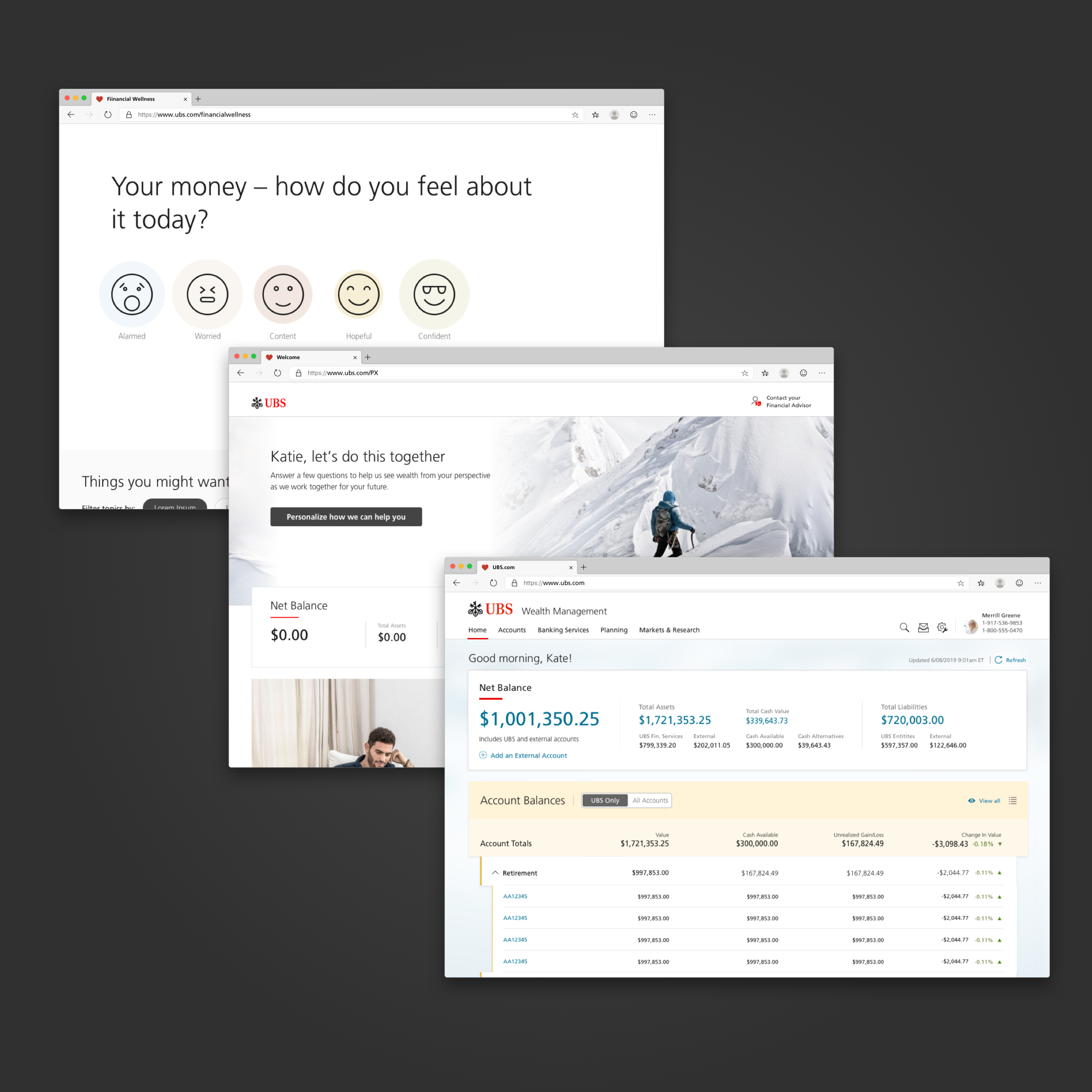
Following the re/design & launch of their iPad and iPhone app, UBS wanted to redesign their authenticated website experience to provide a cohesive and seamless experience for their clients, as well as launch a brand new Financial Wellness program and a program for prospective clients.
Process:
Before all the projects came to the UX/UI team, I collaborated with our strategy team & client to create concepts for a brand new experience that would help integrate seamlessly into existing legacy systems.
Setting the Journey vision:
Once we determined the directions for each, we used an existing framework of the navigation and components to create a cohesive experience for a client at any point of their customer journey — whether they are a non-client, partial-client, or a fully engaged retail client.
This helped to discover the connecting pieces and shared features amongst the different project streams, which helped prioritize the MVP items in the different teams & how it will be shared in the future sprints.
After getting the projects kicked off, I focused mainly on the dashboard redesign work stream to help set the tone for other projects. This was a complicated process that took multiple user interviews and collaboration with client’s vendors.
Digging deeper into UBS.com information architecture:
The main pieces to be tackled for the overarching UBS.com experience was the navigation/sitemap. I assessed the existing site and analytics to create a proposal, and conducted treejack testing to determine optimal navigability.
Alignment and roadmapping workshops:
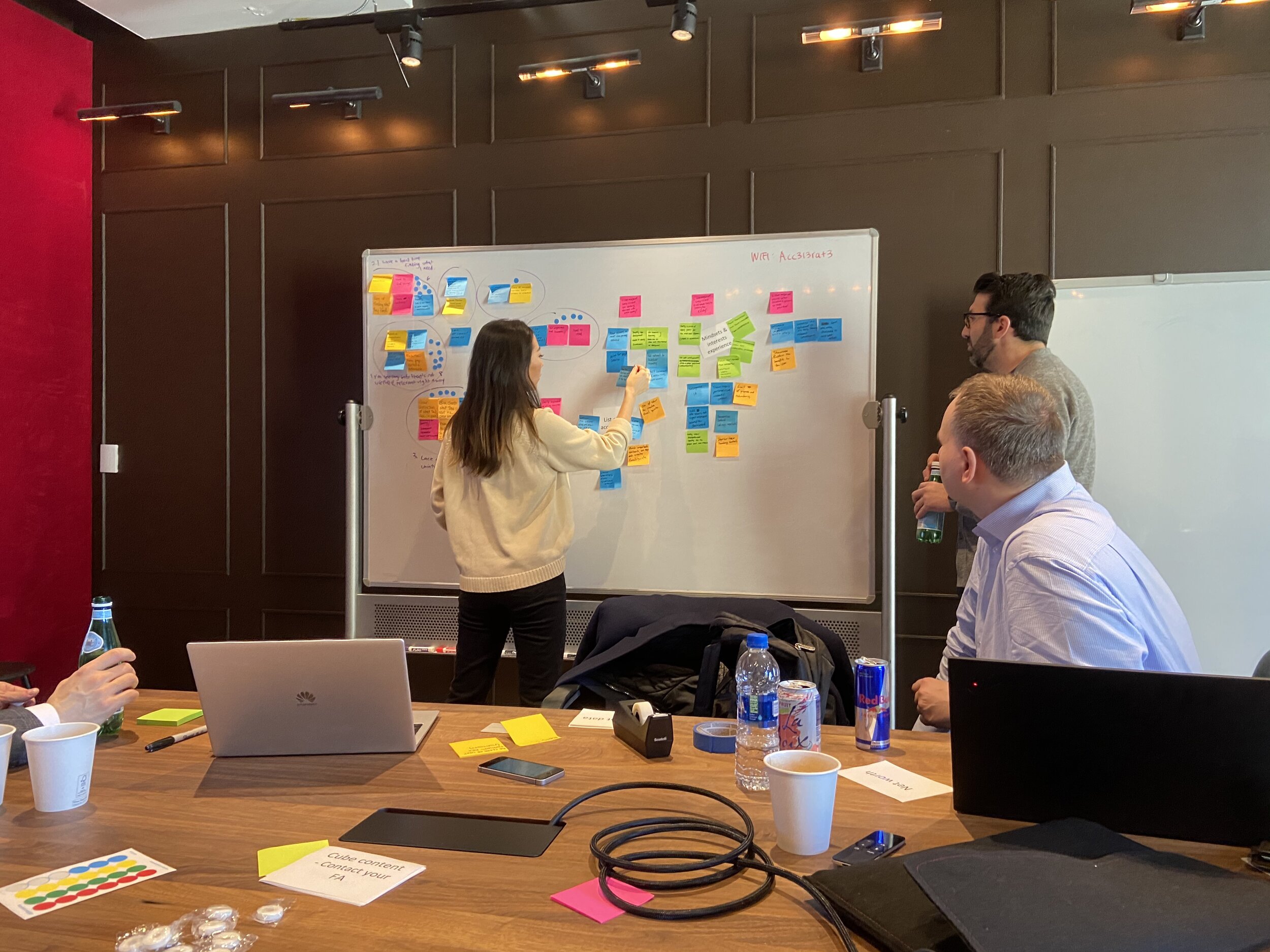
In order to gain early alignment with the new team, I ran planning workshops to help determine our project goals and MVP items. We generated a healthy and actionable list of requirements and prioritized them to be plotted on our roadmap.
Concepting:
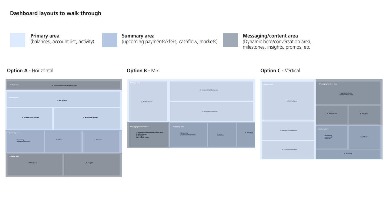
After assessing current site analytics and necessary features determined for MVP, I created three different dashboard concepts which would act as the main landing page, as well as interaction options leveraging competitive analysis and our iphone and ipad designs.
Usertesting to validate:
Then, we tested these options with UBS clients and non-clients.
During the research phase, we validated the top priority order of information and what interactions worked the most intuitively.
For almost all participants, they found the horizontal layout option the most reflective of their conceptual model, and explicitly wanted their investment and banking activities visually divided out much like their mental model.
Using that as a starting point, we created a more refined design of the dashboard.
Project planning:
Then, I planned the following 6 weeks of work with codependencies across teams in mind; there were to be some shared components across the 3 different experiences. I held multiple work sessions with the collaborating product teams to determine which team will be responsible for designing and building certain components.
Outcome:
We added 2 more sprints at the end to accommodate the navigation build as it became a larger feat than our immediate team had envisioned. However, we were able to launch the designed experience successfully, along with the Prospective Client experience and for the new Financial Education experience, which were two additional project streams I was helping lead.
Customer and customer outcome:
The new design was accepted well. The % of digital engagement within clients increased, and we also saw an increase in traffic to the new banking experience we designed prior to this project.
Due to the continued success in designing and launching great client experiences, my team was also engaged further by UBS to help re-imagine and redesign their relationship building tool for Financial Advisors.
Thank you
